Martin Caust
Selected graphs 6.4

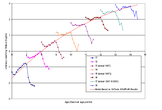
The graph illustrates the mean score
for each age group (in 0.1 of a year) derived from the model developed
in Chapter 6. For the thesis a data set was developed to
attempt to illustrate what seems to happen (or might happen in this
case) if all students in Year levels 1 to 8 were tested in 'Literacy'
at the same time. Actual data were only available for Year levels
3 and 5 (and 7 from a later calendar year). The framework (the
red line) for the model is developed from a number of sources (see
Chapter 6). The red line is also the idealised line of the age
group means when Year level is ignored (tails and kick-ups are
'smoothed' out).
Return to Selected Graphs.
The numeracy equivalent